7 elements of a landing page for success
If you're reading this post, it is because you are looking for examples of the best landing page for your marketing strategy, and it is...
Have you made a marketing campaign with that you get a lot of clicks, but you don't get users to fill out the form on your landing page?
This is because your landing page is not properly optimized for the conversion.
Don't worry, in the article today, we will explain to you what elements you should take into account to achieve a good design for landing page, with practical examples so that you can replicate them in your website.
What is a landing page?
In the first place, before seeing how to create a landing page, it is important to understand what is and what is their function within the overall strategy.
A landing page or landing page, is a page with a very concrete: get leads, that is to say, a page where you bring to the users that got it through online advertisements to leave us your contact data.
Landing pages, are characterized by having a simple look, with less elements of the normal and, in turn, require a special optimization for when you arrive, the user, get to carry out the action by which we have drawn.
How to create a landing page that converts?
1. The Call-to-Action
The CTA (call-to-action), or the call-to-action should be clear and concise.
For example: “Download guide”, “Request a demo”, “Ask for more information” are better choices than “click here” or “See more”.
The color of the CTA is also relevant, not so much because a color to become better than the other, (which to discover which color has more of an impact than another, it is necessary to do an a/B test), but the contrast of this with the rest of the page.
The color of the CTA, you must stand out from the rest of the colours in the landing page. When you choose your position, what is more important is that it occupies a place that is visible and relevant.
2. Nice title

The title should be eye-catching, but it should also be realistic. It is the first thing that reads the user, the first message that you receive and, therefore, the first moment that will decide if you are interested in the content or not.
The title should be short and avoid promising more than it really is going to offer, but at the same time you have to achieve to capture the attention of the user and offer a clear benefit of the product.
Below the title, you can add a subtitle to complete the information given in the title.
3. Value proposition
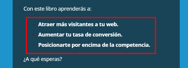
Something fundamental in the landing page, is to make clear what is the value proposition. Clearly explain what the product consists of and define what are the benefits and the advantages for the user to buy the product or hiring a service.
A listing of points of the benefits is a good choice for the format, in this way the user can read easily and allows you to give the information in a concise manner.
As in the case of the title, it is critical that the value proposition is realistic.
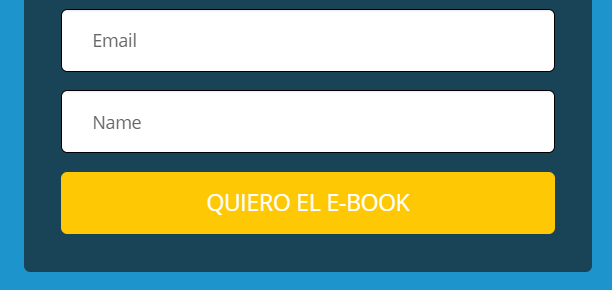
4. The form
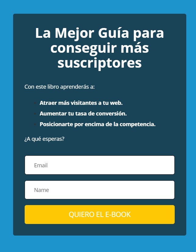
The form is one of the most critical points of a landing page, users tend not to be willing to fill. For this reason, it is necessary to keep it as simple as possible, that is to say, to ask for only the information we need, because if the form is very long and have many fields, it is possible for the user to resign to fill it.
5. Elements of trust and credibility

As we have mentioned in previous points, credibility and trust are fundamental to achieve conversions on a landing page.
Include testimonials that speak well of the product or service, it is a good way to gain the trust of the user. It is important that these testimonies come from reliable sources as may be prestigious partners or acquaintances.
In addition to testimonials, you can also include certifications, or awards. It is very important that all this information is truthful.
6. Space between the elements
An element that contributes to the conversion is to leave space between the different elements elements that compose it. On the one hand, these spaces allow you to create a landing more clean without overwhelming the user. Finally, it is important to note that white spaces, we are going to be useful to highlight each one of the elements of landing, as they work as a framework.
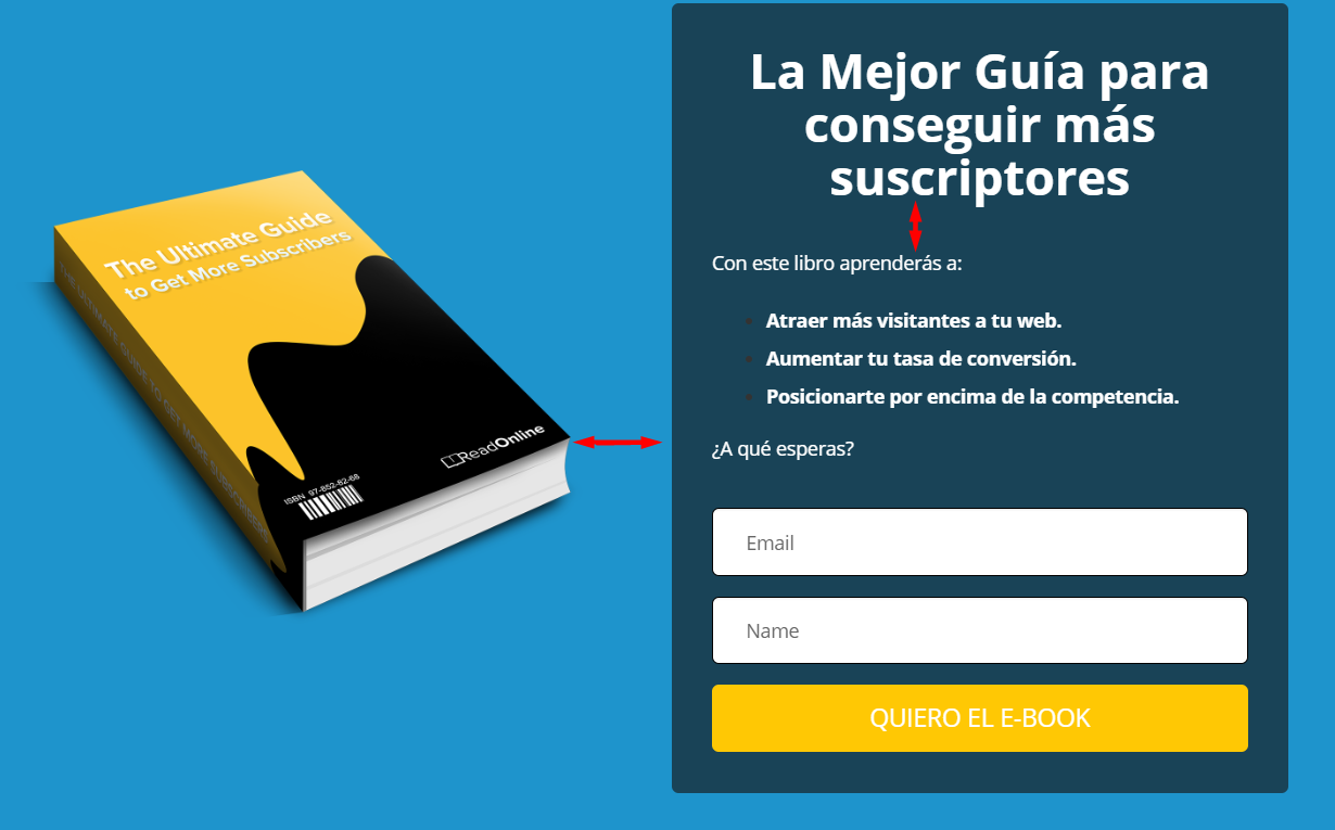
7. Multimedia elements
Last, but not least, we have to take into account the elements of multimedia, the use of video and images; for all of them also contribute to the conversion.
A picture is worth a thousand words. That is why it is very important that the photos you selected for the landing page are of good quality and relevant. This is not to include images for the simple fact that they are attractive, because we run the risk of distracting the attention of the user. Thus, we must search for images that add value to the information that we're giving on the page.
For example, an image related to the product or the benefits it has for the user.
Examples of landing page
Below, we're going to show you a few examples of landing pages effective, which you will be able to imitate it yourself design, completely free of charge.
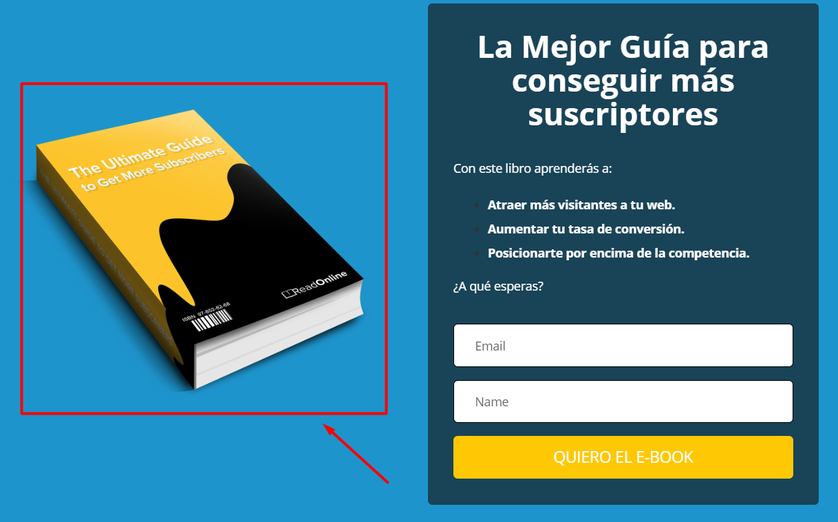
Example 1 – Pangea
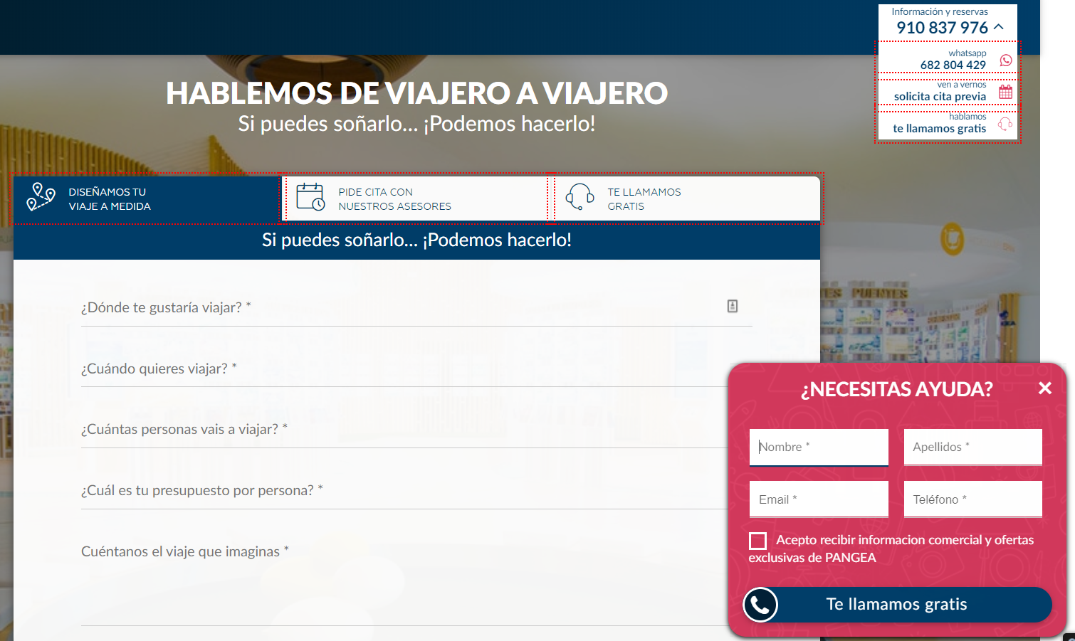
We emphasize this landing page, since it includes a very interesting element to the conversion: The pop up format simple form to low to the right.
This allows the user to get in touch with the company in a more rapid, convenient and efficient.
Example 2 – Shopify
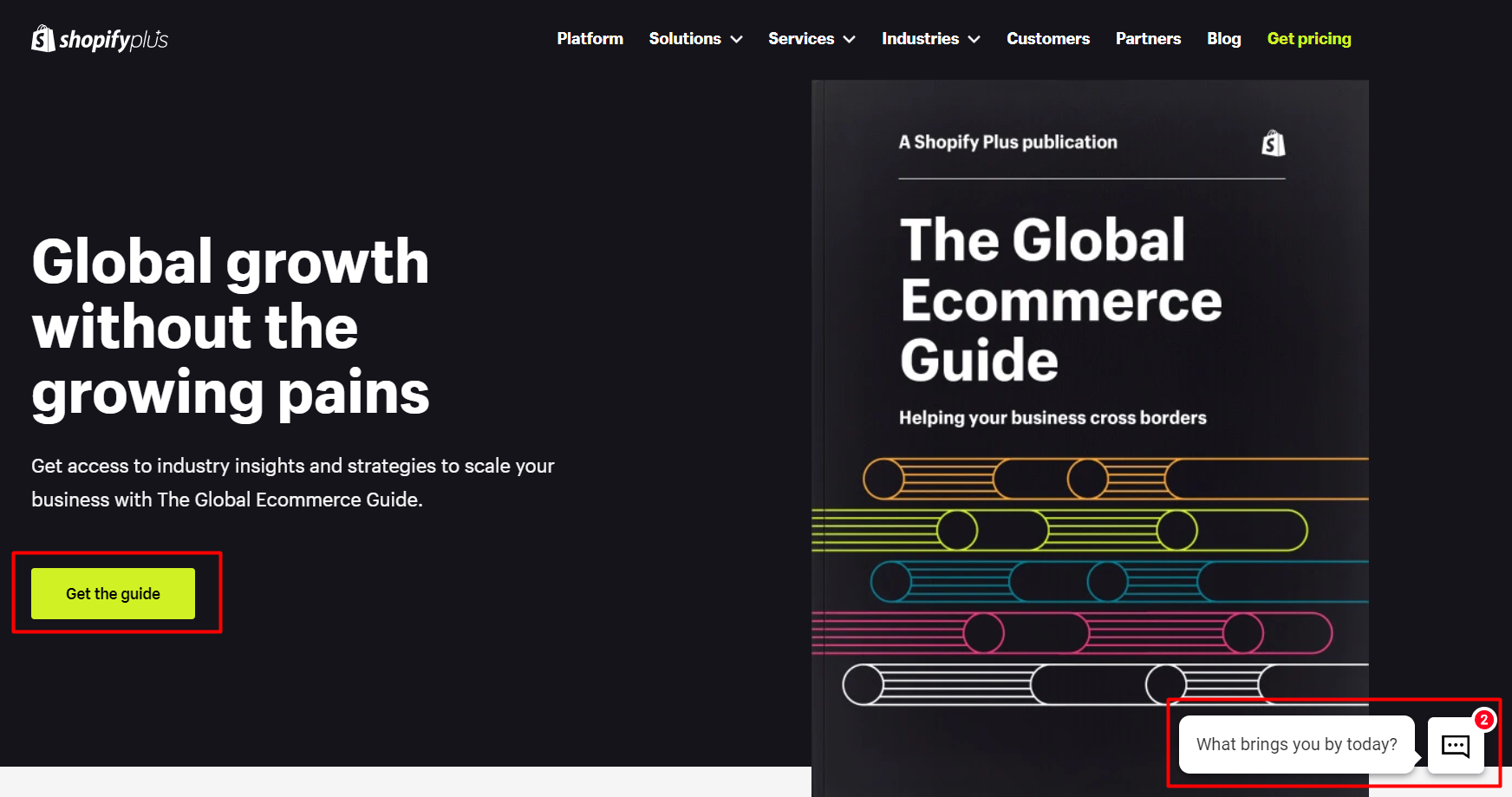
In this example, is shown as there is a title well large and attractive, as well as graphic material enough in order to get an idea of what you are going to receive (without this steal all the attention), and finally, there are elements (we've checked), which contrast and draw attention: The button of CTA, along with the chat in white at the bottom right.
Example 3 – Holded
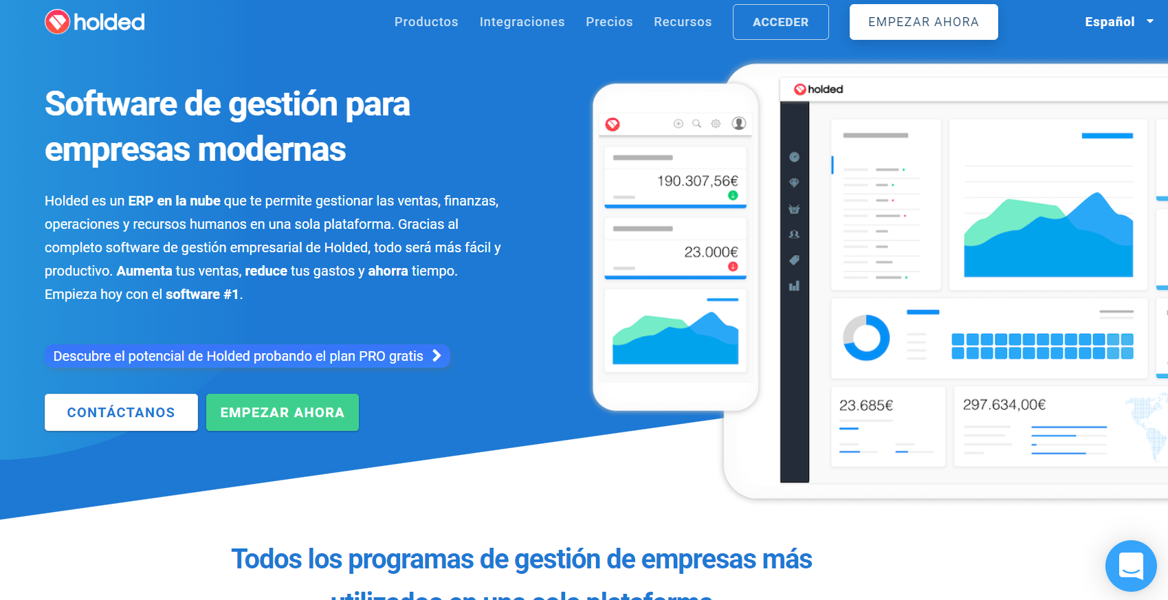
Finally, we see that even this landing page, takes place 3 buttons call to action: all differentiated with different colors between them.
Contains a chat to contact directly with the company, as well as some very real benefits of what you are going to bring that product to the user.
If you analyze all the points you will see that a good landing page is primarily based on two principles:
- Provide all the relevant information and accurate information
- Provide this information in a simple way so as not to distract the user.
We hope that these tips will be useful and you have them in mind when designing the landing pages you need for your campaigns of digital marketing.

